# Parameters
# Parameter attributes
The Configurator always displays the Parameter of the selected Component. If no Component is selected, the Parameters of the root Component are displayed. If there are some global parameters and nothing is selected, the parameters in the global context are shown.
IMPORTANT: In Configurations, Parameters' values are saved. All other values and internal variables must always depend on one actual set of Parameters' values or docking setup and can not be dependend on any of previous values, as the previous states are not saved. This means for you, that you must ensure that all the values can be computed properly and all conditional paths must always be reachable.
Let's look at the parameter and its attributes:
{
    "key": "identifier",
    "type": "Decimal",
    "volatile": true,
    "global": false,
    "defaultValue": 1000,
    "labels": {
        "en": "Label",
        "de": "Beschriftung"
    },
    "label": "
        label = label | ' ' | string(width, 0);
    ",
    "group": "grpDefault",
    "sort": 1,
    "unitType": "length",
    "level": 5,
    "enabled": "true",
    "visible": "true",
    "visibleAsGlobal": "false",
    "visibleInPartList": "false",
    "highlighted": "false",
    "validGroups": [],
    "validRange": {},
    "validValues": [],
    "valueObjects": [],
    "conditionalGroups": [],
    "onUpdate"
    "onValueChange": "otherParameter = thisParameter * yetAnotherParameter + 5"
}
keyA unique identifier you will be using to refer to the values of this Parameter. Use camelCase, do not use PascalCase, do not use underlines_to_separate_words. To correctly name the parameters, see the [Naming Convention] chapter.typeThe value type of this Parameter. Can be:Boolean,Integer,Decimal,String,Material,Object.- Note: Only
Materialis available in the Material Configurator (Level 2).
- Note: Only
volatileIf true, the value of this parameter will not be stored in the Configuration when saving it. You can still assign the value from the Configuration when you're loading it.globalRegisters this Parameter to the global context. It will be shown if no component is selected and when selecting a value, it will be assigned to all Component's parameters which are global and have the same key. In the global context, the shown possible values are intersection of all sets of valid values coming from all Components.defaultValueThe value this Parameter will have in its default state, unless overriden with Configuration, supposing the value's condition is true.labelsMap containing key/value pairs for the label of this component. The keys are the isocodes of the language. The values are the labels to be used.labelCustom label generation script. Result is assigned to an internal value calledlabel. At the beginning of the script,labelcontains the current language value from thelabelsobject, so that you can modify it. It is recommended not to store string literals that are part of the modified label in thelabelscript, but to use thecomponent.dataobject instead under the pathtranslations.groupKey of a group to which this parameter is assigned to.sortBy default, the order of displayed Parameters matches the order in the JSON. You can override this by putting integer values, where the lowest value is on the top. Unsorted parameter will keep the order in the JSON and will be ordered behind the parameters that have thesortvalue defined. Hint: use multiplies of 10 or 100 to sort the parameters, allowing you to add new parameters in between without having to change the order of all of them.unitTypeSets a special behaviour in representation of the values. Can be:length,area,count,angle.enabledIf this is evaluated as false, the UI control will be greyed out and the user won't be able to interact with this Parameter. Also, if a global value is selected, it will not be assigned to this parameter. Disabled global parameters are not registered in the global context at all.visibleWhether it is visible or hidden as a local Parameter, when the component is selected. This attribute should always be explicitely used. This only applies to the local context. UsevisibleAsGlobalin tandem for hiding the parameter from local and/or global context.visibleAsGlobalIf this Parameter is global, determines whether it will be visible if nothing is selected, in the global context. This is the preferred way to show and hide global parameters.visibleInPartListWhether this parameter and its value is visible as a part list entry.highlightedCurrently unused by the configurator. Intended to highlight the parameter in UI.validGroupsPlain list of material tags. If type is Material, it will show all materials tagged by the tag id.validValuesPlain list of possible values. They are always shown. Note: you can combinevalidValuesandvalueObjects.valueObjectsList of value objects, which acts as valid values, but can define their labels, show thumbnail images and disable themselves using itsconditionscript.validRangeChanges an Integer or Decimal Parameter's UI to a slider. Can not be combined with discrete values.conditionalGroupsList of value objects, where the values are tags. Usable with Material.onUpdateScript that runs in every component update call. Only computations that are relevant to this parameter should be used. Usage of assignments to internal values are possible, but it is easy to create update loops, which reduce performance and cause hard to find errors. It is recommended to avoid assignments to one internal value from multiple onUpdate sscripts. It also lowers the understandability of the component. Generally, this script can be really helpful, but you should use this onUpdate script only when you have a direct purpose and know what you're doing.onValueChangeIf the value of the parameter is different from the value it had in the previous update loop, this script is fired. Useparameter.userTriggeredChangeboolean getter inside this script, which returns true if the change is triggered by the user changing this parameter value via the configurator UI (i.e. not from a script during docking, on configuration reload etc.).
# Parameter's Relevant Values
Parameters should be written in a way, that only values that are relevant can be used in that parameter. This can be a problem with parameters that are hidden from UI, where they could be changed to something else via a configuration JSON, bringing unexpected behaviour. This override can also happen, if more objects are selected at once (using multi-selection tool).
# Parameter Types and Unit Types
The type key in a Parameter is not the same as a data type. Description of RoomleScript data types can be found in [RoomleScript Overview]. Parameter types follow:
# types:
BooleanA checkbox UI control with the Parameter-level next to it. The value which is stored is 1 for true and 0 for false.IntegerA button UI control where the Parameter holds Integer values.DecimalA button UI control where the Parameter holds Decimal values. The values labels will have two decimal places displayed (e.g. 100.00).StringA button UI control where the Parameter holds String values. The labels are matching the values.MaterialA material thumbnail + viewable name list UI control from the material database. The values are the materialIds or materials categoryIds and the data type of the values is String.ObjectObject, like a vector or an array. Not intended to be visible. Useful for logical assignments or supersedings in subComponents.
# unitTypes:
lengthConverts numeric value to cm, mm, based on configurator settings and locale.areaShows numeric value as square metersangleShows numberic value as degreescount
# Working with Imperial Measurements - Inches and Feet
The default unit of the configurator can not be set - it is always milimeters. If you are working in inches, convert all your computations to milimeters using an milimeter to inch ratio 2.54. In order to show the parameters in feet and inches, use parameter values in milimeters, use "unitType": "length" and let the configurator settings convert the milimeters to inches for you. To view the inches in the test site, set Embedding > Main > Unit to inches and reload the configurator. To set direct links of the configurator to inches, use &unit=inchfeet&precisionInch=X as additional arguments, where X is the count of decimal spaces.
Unless you really need to, do not convert the parameters to inches or feet values, which you actually can achieve by not using the unitType and overriding valueObject labels. If you do so, you will have to recompute all coordinates and distances using the 2.54 at some point.
# Value Objects
You often need to limit some combinations of values, modify their labels or add thumbnails to them. To be able to achieve this, the plain list of values is not enough and we need something more complex, which are the valueObjects. A Parameter can have either validValues or valueObjects, not both (there will also be validRange, but we will get to it).
A valueObject has following structure:
{
    "value": "132",
    "labels":{
        "en": "Custom label",
        "de": "Definierte Beschriftung"
    },
    "label": "
        if (aCondition) {
            If (language == 'de') {
                label = 'Definierte Beschriftung A';
            } else {
                label = 'Custom label A';
            }
        } else {
            label = label | ' B';
        }
    ",
    "condition": "booleanExpression",
    "thumbnail": "url-to-an-image-in-Rubens Admin"
}
valueThe value that will be internally used and stored in Configurations.labels,labelSee how those attributes work for the Parameter label. It is the same, but label will be applied to the value itself.conditionA boolean expression that defines the visibility and possibility to select this valueObject. Once the condition gets to false when this valueObject is selected, first valid valueObject from the list is the fallback.thumbnailURL to a thumnbail image from the Rubens Admin.
# Example: Parametrized Table Value Combinations
To best describe the usage of the valueObjects, let's say the table widths are called S, M and L and the table comes in two depth options: Standard and Extra, where the S width is not available in the Extra depth. To keep using the original numerical length values for the width and depth, we use valueObjects and we will modify the labels. For limiting the options combinations, we use the condition. The parameters field of the table will look like this:
Unfold to see the final parameters code.
"parameters": [
    {
        "key": "width",
        "type": "Decimal",
        "labels": {
            "en": "Width",
            "de": "Breite"
        },
        "unitType": "length",
        "defaultValue": 1000,
        "valueObjects": [
            {
                "value": 800,
                "condition": "depth < 700",
                "labels": {
                    "en": "S",
                    "de": "klein"
                }
            },
            {
                "value": 1000,
                "labels": {
                    "en": "M",
                    "de": "mittel"
                }
            },
            {
                "value": 1200,
                "labels": {
                    "en": "L",
                    "de": "groß"
                }
            }
        ],
        "enabled": true,
        "visible": true,
        "visibleInPartList": true
    },
    {
        "key": "depth",
        "type": "Decimal",
        "labels": {
            "en": "Depth",
            "de": "Tiefe"
        },
        "unitType": "length",
        "defaultValue": 600,
        "valueObjects": [
            {
                "value": 600,
                "labels": {
                    "en": "Standard",
                    "de": "standard"
                }
            },
            {
                "value": 700,
                "condition": "width > 800",
                "labels": {
                    "en": "Extra",
                    "de": "extra"
                }
            }
        ],
        "enabled": true,
        "visible": true,
        "visibleInPartList": true
    }
]
IMPORTANT: In the last example, you can notice that the parameters' valueObjects conditions influence each other. If you are not careful, this can lead to a deadlock where you won't be able to select a certain combination of values and get back out of a such combination. For example, size L is available only with Extra depth and the Extra depth is available only in size L.
# Creating and Updating Values with Thumbnails
You can use valueObject.thumbnail attribute to assign thumbnails to value objects of non-material parameters. As mentioned above, materials automatically link their thumbnails. You typically should use an item (product) Perspective image (not the Perspective HD image) thumbnail, where you right click on the image in Rubens Admin and copy its address. Paste the address as the thumbnail key's value.
There are cases where the perspective automatically generated image is unsuitable. In those cases, it is recommended to use the Additional Content section in the Rubens Admin product entry page.
Be aware that you must copy the new links in case you update the image, be it the perspective image or the image from the additional content.
# Variable parameters, parameterGroups and valueObject labels
Similarly like Component Label, parameters, parameterGroups and valueObject provide a labels map and label script that can serve for manipulating its label via RoomleScript.
A label map is a collection of language keys and label pairs. The keys are the isocodes of the language.
If the label for a requested language does not exist in a label map, the English label is used.
If the English label is requested but does not exist, the key or value of the object is used instead of the label.
In a label script, a label will be generated completely dynamically. Once a label script is preset, the label map is ignored.
However, the label from the labels map is the input label of the label script.
{
    "id": "test:diameter",
    "parameters": [
        {
            "key": "shape",
            "type": "String",
            "defaultValue": "value",
            "validValues": [
                "square",
                "round"
            ]
        },
        {
            "key": "size",
            "type": "Decimal",
            "defaultValue": 1000,
            "valueObjects": [
                {
                    "value": 500,
                    "label": "
                        if (shape == 'round') {
                            label = 'Ø 50 cm' | label;
                        } else {
                            label = '50 cm';
                        }
                    ",
                    "condition": "true"
                },
                {
                    "value": 1000,
                    "label": "
                        if (shape == 'round') {
                            label = 'Ø 100 cm' | label;
                        } else {
                            label = '100 cm';
                        }
                    ",
                    "condition": "true"
                }
            ]
        }
    ]
}
Value object label scripts can be combined with the automatically unit formatted values.
In the example below, the values label of the "size" parameter is "ø 100 cm" if isRound and "100 cm" otherwise.
{
    "id": "test:diameter",
    "parameters": [
        {
            "key": "size",
            "type": "Decimal",
            "defaultValue": 1000,
            "unitType": "length",
            "valueObjects": [
                {
                    "value": 1000,
                    "label": "isRound ? 'ø ' | label : label",
                    "condition": "true"
                }
            ]
        }
    ]
}
# Storing string literals for the label scripts
It is not recommended to store string literals in the label scripts by hard coding. Use the component.data.translations object like in the following example. Tools to import and export labels to and from components are in development and they are counting with such a pattern, where the data path of the translations is:
'translations', translationKey, language
Example:
{
    ...
    "parameters": [
        {
            "key": "kind",
            "labels": {
                "en": " type",
                "de": "orte"
            },
            "label": "
                _.key = isVegetable ? 'vegetable' : 'fruit';
                /*
                    Try to retrieve current language translation, fallback to english.
                    If you can not make sure that even the english value exists, use
                    getDataWithDefault insted of getData in the fallback value.
                */
                _.prefix = getDataWithDefault(
                    'translations', _.key, language,
                    getData('translations', _.key, 'en')
                );
                label = _.prefix | label;
            "
        }
    ],
    ...
    "data": {
        "translations": {
            "vegetable": {
                "en": "Vegetable",
                "de": "Gemüse"
            },
            "fruit": {
                "en": "Fruit",
                "de": "Obst"
            }
        }
    }
}
# Ranges
Ranges allow you to make a slider UI control. You can specify the lower and upper bounds of the range and optionally also a constant step size. An example of a range Parameter follows:
{
    "key": "range",
    "defaultValue": 150,
    "type": "Decimal",
    "validRange": {
        "valueFrom": "100",
        "valueTo": "300",
        "step": "50"
    },
    "enabled": true,
    "visible": true,
    "visibleInPartList": true
}
Note: As of 2023, there is no possibility to combine a range with valueObjects or validValues to have these values on a slider. On the other hand, there is a possibility to have the bounds parametrized, all attributes of the validRange object are expressions.
# Parameter Groups
In order to provide better user experience, you can divide parameters into groups. Groups will appear as sections in the Roomle Configurator, leading the end users through the process of configuring their products in a wizard-like manner. The groups are defined in the parameterGroups list and will be shown in the configurator, when at least one member parameter is visible in the current context.
Rule: All parameters should either be grouped or non-grouped. Combination of grouped and non-grouped parameter is not recommended.
To define a parameter group, use following list at the root of the component:
...
"parameterGroups": [
    {
        "key": "grpKey",
        "labels": {
            "en": "group label"
        },
        "label": "aCondition ? 'label A' : label B",
    }
],
...
keyA unique identifier you will be using to refer to the values of this Parameter.labels,label- refer to Parameter or Value Object for usage.
To use the group, add a group attribute, where the value is equal to one of the parameterGroup.key values. The parameter is then assigned to that group:
    ...
    "parameterGroups": [
        {
            "key": "grpDimensions",
            ...
        }
    ],
    "parameters": [
        {
            "key": "width",
            "group": "grpDimensions",
            ...
        }
    ],
    ...
# Example: Parameter Grouping
In this example, we will show how to prepare parameters for a table, that consist of a tabletop, a frame and four cylindrical telescopic adjustable legs, allowing to set the table's worktop height between 680 and 730 mm.
Because the main product defining parameter are the dimensions, they will go in a group called "Size". In order to let the users visualize all possible heights of the table, we will use another group, "View", with a parameter called "Tabletop height"
Unfold to see the source code that injects groups and a range parameter into the previous example.
{
    "id": "catalog_id:component",
    "parameterGroups": [
        {
            "key": "grpSize",
            "labels": {
                "en": "Size"
            },
            "collapsed": false,
            "sort": 0
        },
        {
            "key": "grpView",
            "labels": {
                "en": "View"
            },
            "collapsed": false,
            "sort": 0
        }
    ],
    "parameters": [
        {
            "key": "width",
            "group": "grpSize",
            "labels": {
                "en": "Width"
            },
            "type": "Decimal",
            "unitType": "length",
            "defaultValue": 1000,
            "validValues": [
                800,
                1000,
                1200
            ],
            "enabled": true,
            "visible": true,
            "visibleInPartList": true
        },
        {
            "key": "depth",
            "group": "grpSize",
            "labels": {
                "en": "Depth"
            },
            "type": "Decimal",
            "unitType": "length",
            "defaultValue": 600,
            "validValues": [
                600,
                700
            ],
            "enabled": true,
            "visible": true,
            "visibleInPartList": true
        },
        {
            "key": "tabletopHeight",
            "group": "grpView",
            "labels": {
                "en": "Tabletop Height"
            },
            "type": "Decimal",
            "unitType": "length",
            "defaultValue": 710,
            "validRange": {
                "valueFrom": 680,
                "valueTo": 730
            },

            "enabled": true,
            "visible": true,
            "visibleInPartList": true
        }
    ],
    "onUpdate": "",
    "geometry": "AddCube(Vector3f{width, depth, 1000});",
    "articleNr": "'123.465'"
}
# Examples of Parameters and their UI Represenatations
# Type: Boolean - Yes/No Option
A boolean parameter will always show Yes and No as options, regardless on language. This is automatic, boolean values can not be overriden.
{
    "id": "example:parameter_boolean",
    "parameters": [
        {
            "key": "boolean",
            "labels": {
                "en": "Boolean Parameter"
            },
            "type": "Boolean",
            "defaultValue": true,
            "validValues": [
                true,
                false
            ]
        }
    ]
}

# Type: Integer and Decimal
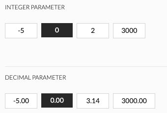
Integer and decimal parameters will automatically create clickable options showing the numbers. Keep in mind, that decimal is always displayed with two trailing decimal spaces, regardless of how many of them you define in the values.
{
    "id": "example:parameter_integer",
    "parameters": [
        {
            "key": "integer",
            "labels": {
                "en": "Integer Parameter"
            },
            "type": "Integer",
            "defaultValue": true,
            "validValues": [
                -5,
                0,
                2,
                3000
            ]
        },
        {
            "key": "decimal",
            "labels": {
                "en": "Decimal Parameter"
            },
            "type": "Decimal",
            "defaultValue": true,
            "validValues": [
                -5,
                0,
                3.1415,
                3000.00
            ]
        }
    ]
}
# Unit Type: Length
This will automatically create labels based on what the current value of the configurator's unit attribute is. Therefore following code will have different results based on the locale of the language and area settings of the machine the configurator is running on.
{
    "id": "example:parameter_decimal",
    "parameters": [
        {
            "key": "decimal",
            "labels": {
                "en": "Decimal Parameter"
            },
            "type": "Decimal",
            "unitType":"length",
            "validValues": [
                -5,
                0,
                25.4,
                3000.00
            ]
        }
    ]
}
default or unit=cm

unit=inchFeet

unit=mm

# Material or Parameter with Thumbnails
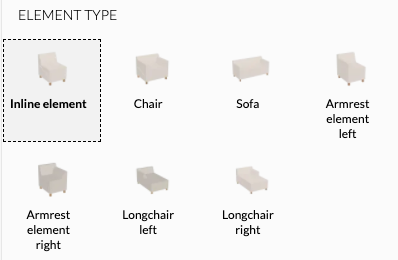
Up to 5 thumbnail fit on a single line. If there are more parameters, the rest of them will be compacted behind the "Show all" button, replacing the 5th thumbnail, unless that parameter is not the only one in the group. Thumbnails are links to images defined in valueObject.thumbnail.
A single thumbnail parameter in the group context will display unfolded.
{
    "id": "example:parameter_full_thumbnail",
    "parameters": [
        {
            "key": "elementType",
            "type": "String",
            "labels":{
                "en": "Element Type"
            },
            "valueObjects": [
                {
                    "value": "inline", "labels": {"en": "Inline element"},
                    "thumbnail": "https://catalog.roomle.com/85dbd885-7582-4780-bdd7-f976ec6b49d9/items/bestsofa_inline/perspectiveimage.png?marker=1590759964"
                },
                {
                    "value": "armchair", "labels": {"en": "Chair"},
                    "thumbnail": "https://catalog.roomle.com/85dbd885-7582-4780-bdd7-f976ec6b49d9/items/bestsofa_armchair/perspectiveimage.png?marker=1598434263"
                },
                {
                    "value": "sofa", "labels": {"en": "Sofa"},
                    "thumbnail": "https://catalog.roomle.com/85dbd885-7582-4780-bdd7-f976ec6b49d9/items/bestsofa_sofa/perspectiveimage.png?marker=1598434181"
                },
                {
                    "value": "inlinearmrest_left", "labels": {"en": "Armrest element left"},
                    "thumbnail": "https://catalog.roomle.com/85dbd885-7582-4780-bdd7-f976ec6b49d9/items/bestsofa_inlinearmrest_left/perspectiveimage.png?marker=1590759310"
                },
                {
                    "value": "inlinearmrest_right", "labels": {"en": "Armrest element right"},
                    "thumbnail": "https://catalog.roomle.com/85dbd885-7582-4780-bdd7-f976ec6b49d9/items/bestsofa_inlinearmrest_right/perspectiveimage.png?marker=1590758015"
                },
                {
                    "value": "longchair_left", "labels": {"en": "Longchair left"},
                    "thumbnail": "https://catalog.roomle.com/85dbd885-7582-4780-bdd7-f976ec6b49d9/items/bestsofa_longchair_left/perspectiveimage.png?marker=1590758913"
                },
                {
                    "value": "longchair_right", "labels": {"en": "Longchair right"},
                    "thumbnail": "https://catalog.roomle.com/85dbd885-7582-4780-bdd7-f976ec6b49d9/items/bestsofa_longchair_right/perspectiveimage.png?marker=1590759065"
                }
            ]
        }
    ]
}
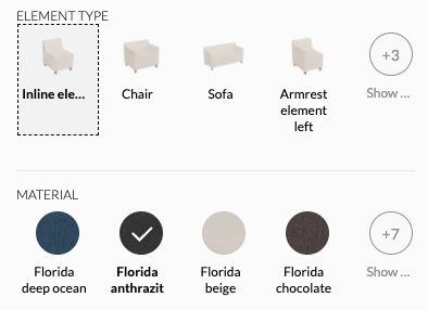
Materials parameters are automatically displayed with thumbnails. The source of the image is the thumbnail of the material in the Rubens Admin. If the material has no diffuse map and there is no custom thumbnail, the plain colour is used. If we combine the elementType parameter with a new material parameter in a single group context, they both will be compacted (unless they have less then 5 valid options), displaying first 4 and a "Show all" button.
{
    "id": "example:parameter_compacted_thumbnail",
    "parameters": [
        {
            "key": "elementType",
            "type": "String",
            "labels":{
                "en": "Element Type"
            },
            "valueObjects": [
                {
                    "value": "inline", "labels": {"en": "Inline element"},
                    "thumbnail": "https://catalog.roomle.com/85dbd885-7582-4780-bdd7-f976ec6b49d9/items/bestsofa_inline/perspectiveimage.png?marker=1590759964"
                },
                ...
            ]
        },
        {
            "key": "material",
            "type": "Material",
            "labels":{
                "en": "Material"
            },
            "validValues": [
                "candy:florida_anthrazit",
                "candy:florida_beige",
                "candy:florida_chocolate",
                "candy:florida_dark_grey",
                "candy:florida_deep_ocean",
                "candy:florida_espresso",
                "candy:florida_grey",
                "candy:florida_light_blue",
                "candy:florida_rot",
                "candy:florida_saphran",
                "candy:florida_stone"
            ]
        }
    ]
}
# Buttons vs Dropdown
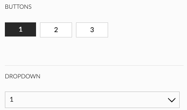
Following parameters differ in nothing but the count of validValues. The first will be displayed as button options, the second as a dropdown. The configurator itself decides which of them to display. If the values fit to a single line, buttons are displayed, otherwise this changes to a dropdown.
{
    "id": "example:parameter_buttons_dropdown",
    "parameters": [
        {
            "key": "buttons",
            "labels": {
                "en": "Buttons"
            },
            "type": "Integer",
            "validValues": [
                1,2,3
            ]
        },
        {
            "key": "dropdown",
            "labels": {
                "en": "Dropdown"
            },
            "type": "Integer",
            "validValues": [
                1,2,3,4,5,6,7,8,9,10,11,12
            ]
        }
    ]
}
# Range
To create a slider, use validRange instead of validValues or valueObjects in a parameter of type Integer or Decimal. unitType applies for ranges in the same way like for a standard numeric parameter. valueFrom, valueTo and step are of Script<float> type, therefore expression can be used in them. Keep in mind, that although the step can be variable, the step is uniform. Maximum value is lesser or equal to valueTo, while minimum value equals to valueFrom.
{
    "id": "example:parameter_buttons_dropdown",
    "parameters": [
        {
            "key": "rangeStep",
            "type": "Decimal",
            "validValues": [1, 10, 100]
        },
        {
            "key": "range",
            "defaultValue": 0,
            "type": "Decimal",
            "unitType":"length",
            "validRange": {
                "valueFrom": -1000,
                "valueTo": 999,
                "step": "rangeStep"
            },
            "enabled": true,
            "visible": true,
            "visibleInPartList": true
        }
    ]
}

# Object parameters
You can store an array, Vector2f and Vector3f in parameters of type Object. This can be useful especially for assignments and supersedings, where you don't need to have 3 separate Decimal parameters instead of one Object parameter of Vector3 type.
# Example: Utilizing Parameter of Type Object
Note: defaultValue for Object is not supported. Do initialization in onUpdate - init instead.
Unfold to see code examples for a parameter of type `Object`.
{
    "id": "catalogId:object_parameter",
    "parameters": [
        {
            "key": "size",
            "type": "Object",
            "visible": true,
            "visibleInPartList": true
        }
    ],
    "onUpdate": "
        if (ifnull(inited, false) == false) { inited = true;
            size = Vector3f{100, 200, 300};
        }
        size_x = xFromVector(size);
        size_y = yFromVector(size);
        size_z = zFromVector(size);
    ",
    "geometry": "
        AddCube(Vector3f{size_x, size_y, size_z});
    "
}
{
    "id": "catalogId:object_master",
    "subComponents": [
        {
            "internalId": "CUBE",
            "componentId": "catalogId:object_parameter",
            "numberInPartList": "1",
            "assignments": {
                "size": "sizeAsVector3"
            }
        }
    ],
    "onUpdate": "sizeAsVector3 = Vector3f{500, 100, 300};",
    "geometry": "SubComponent('CUBE');"
}
{
    "id": "catalogId:object_parameter_array",
    "parameters": [
        {
            "key": "sizes",
            "type": "Object",
            "visible": true,
            "visibleInPartList": true
        }
    ],
    "onUpdate": "
        if (ifnull(inited, false) == false) { inited = true;
            sizes = [100, 200, 300];
        }
    ",
    "geometry": "
        for (_.i = 0; _.i < length(sizes); _.i = _.i + 1) {
            AddCube(Vector3f{100, 100, get(sizes, _.i)});
             MoveMatrixBy(Vector3f{_.i * 100, 0, 0});
        }
    "
}
# Arrays and Vectors as Parameter Values
As you've read in the previous example, it is not supported to initialize an Object parameter with a vector or array. This is because it would be expensive to try to parse an object into several data types and it is basically a guess work for the kernel. You can do it instead by using a parameter of type string and wrapping its value by an internal variable, that holds the object parsed by respective functions. Those are stringToArray, stringToVector2f, stringToVector3f. See following example:
{
    "id": "roomle_script_test:rml3541",
    "parameters": [
        {
            "key": "distributionParameter",
            "type": "String",
            "defaultValue": "[2, 1, 2]",
            "visible": true,
            "visibleInPartList": true,
            "valueObjects": [
                {
                    "value": "[2, 1, 2]",
                    "condition": true
                },
                {
                    "value": "[3, 1, 3]",
                    "condition": true
                },
                {
                    "value": "[3, 2, 1, 2, 3]",
                    "condition": true
                }
            ]
        },
        {
            "key": "sizeParameter",
            "type": "String",
            "defaultValue": "Vector3f{100, 400, 400}",
            "visible": true,
            "visibleInPartList": true,
            "valueObjects": [
                {
                    "value": "Vector3f{100, 100, 100}",
                    "condition": true
                },
                {
                    "value": "Vector3f{100, 400, 400}",
                    "condition": true
                },
                {
                    "value": "Vector3f{100, 1000, 1000}",
                    "condition": true
                }
            ]
        },
        {
            "key": "uvScaleParameter",
            "type": "String",
            "defaultValue": "Vector2f{1, 1}",
            "visible": true,
            "visibleInPartList": true,
            "valueObjects": [
                {
                    "value": "Vector2f{1, 1}",
                    "condition": true
                },
                {
                    "value": "Vector2f{2, 2}",
                    "condition": true
                },
                {
                    "value": "Vector2f{5, 1}",
                    "condition": true
                }
            ]
        }
    ],
    "onUpdate": "
        distribution = stringToArray(distributionParameter);
        size = stringToVector3f(sizeParameter);
        uvScale = stringToVector2f(uvScaleParameter);
    ",
    "geometry": "
        _.pos = 0;
        for (_.i = 0; _.i < length(distribution); _.i = _.i + 1) {
            _.w = get(distribution, _.i);
            _.u = xFromVector(uvScale);
            _.v = yFromVector(uvScale);
            _.scaleX = xFromVector(size);
            _.scaleY = yFromVector(size);
            _.scaleZ = zFromVector(size);
            AddCube(Vector3f{_.w * _.scaleX, _.scaleY, _.scaleZ}, Vector2f{_.u, _.v}, 0, Vector2f{0, 0}, 20);
             SetObjSurface('demoCatalogId:grid');
             MoveMatrixBy(Vector3f{_.pos, 0, 0});
            _.pos = _.pos + _.w * _.scaleX;
        }
    "
}
