# Advanced Part List Topics
Roomle platform supports various part list features. These include aggregating more pieces of one artilce into packages in defined sizes, change article number based on the package and change the article name accordingly.
# Packaging
Packaging is a feature that will aggregate the articles into packages that have defined number of pieces. Take chair endcaps as example: they are individual pieces and you need (usually) 4. It makes perfect sense that they come packed in sets of 4 pieces. Screws can also be counted individually, but also come in packages with many pieces. Packaging is a defined feature of the component. Amount of one part list entry in the whole configuration is shown in the part list as the count. If the entries have defined package sizes, they will divide into those packages. You define packaging on the component level, using either packageSizes or packaging. While packageSizes is a plain list of integers, packaging allows you to define the package sizes using conditional values.
Let's take a closer look at a following demonstration example of packaging.
{
    "id": "demoCatalogId:example_packagesize",
    "parameters": [
        {
            "key": "count",
            "defaultValue": 0,
            "type": "Integer",
            "validRange": {
                "valueFrom": 0,
                "valueTo": 100,
                "step": 1
            },
            "enabled": true,
            "visible": true,
            "visibleInPartList": true
        }
    ],
    "subComponents": [
        {
            "internalId": "SELF",
            "componentId": "demoCatalogId:example_packagesize",
            "numberInPartList": "count"
        }
    ],
    "packageSizes": [
        1,
        5,
        10
    ]
}
You can see that there is a range parameter called count, which influences the number in of the back-referred component (see Part list Entry part of the SubComponents chapter). This way you can define how many times this component should be present in the part list. The packageSizes define that the articles should be divided into packages of 1, 5 and 10 pieces - and they will do. If you load this and set the count variable to 29, you will see 3 part list entries with counts of 2, 1 and 4 (2 * 10 + 1 * 5 + 4 * 1 = 29). In order to distinguish between what is a package, what is a piece etc., you can compute the article numbers for the individual packaging:
{
    "articleNr": "
        if (packageSize == 1) { articleNr = '120.079.031'; }
        if (packageSize == 5) { articleNr = '120.079.785'; }
        if (packageSize == 10) { articleNr = '120.079.310'; }
    "
}
Resulting part list looks like this:

There are also cases where you need conditional package sizes - the packaging. Typical usecase: a shelf comes in two sizes. One of the sizes comes in packaging of 2 or 4, the other one only in the double package:
{
    "parameters": [
        {
            "key": "shelfWidth",
            "type": "Decimal",
            "labels": {
                "en": "Width"
            },
            "defaultValue": 245,
            "enabled": "true",
            "visible": "true",
            "validValues": [
                245,
                435
            ]
        },
    ],
    "packaging": [
        {
            "size": "2",
            "condition": "true"
        },
        {
            "size": "4",
            "condition": "shelfWidth == '245'"
        }
    ],
    "articleNr": "
        if (shelfWidth == 245) {
            if (packageSize == 2) { articleNr = '645.010'; }
            if (packageSize == 4) { articleNr = '645.020'; }
        }
        if (shelfWidth == 435) { articleNr = '645.030'; }
    "
}
# Component Label
Component-level label is what is shown in the part list as the entry name. In the example above, this label is the example_packagesize and comes from the Rubens Admin component entry label. To batch upload these labels, see Import translations in the Rubens Admin documentation.
However, sometimes you need this label to be variable. Typical example: the packaging. Let's add the label to the examples where the packageSizes have been explained:
{
    "label": "
        if (articleNr == '120.079.031') { label = 'example_packageSize'; }
        if (articleNr == '120.079.785') { label = 'example_packageSize' | ', blister of 5'; }
        if (articleNr == '120.079.310') { label = 'example_packageSize' | ', box of 10'; }
    "
}
Note: you can use packageSize in the label script as you did in the articleNr script - feel free to do so:
{
    "label": "
        if (packageSize == 1) { label = 'example_packageSize'; }
        if (packageSize == 5) { label = 'example_packageSize' | ', blister of 5'; }
        if (packageSize == 10) { label = 'example_packageSize' | ', box of 10'; }
    "
}
The result will be the same, but keep in mind, that tables of article numbers and labels are commonly provided. If you have the data at your disposal in a formalized way, like in a table or in a database, best approach is to generate the code from it. See following Excel formula as an example:
="if (articleNr == '"&A1&"') { label = '"&B1&"'; }", supposing there is articleNumber in the column A and label in the column B.
To be able to translate to other languages, you can use language getter, which is accessible in the label script:
{
    "label": "
        /* first: define labels in fallback */
        if (articleNr == '120.079.031') { label = 'example_packageSize'; }
        if (articleNr == '120.079.785') { label = 'example_packageSize' | ', blister of 5'; }
        if (articleNr == '120.079.310') { label = 'example_packageSize' | ', box of 10'; }
        /* second: override for languages that have labels */
        if (language == 'de') {
            if (articleNr == '120.079.031') { label = 'beispiel_packageSize'; }
            if (articleNr == '120.079.785') { label = 'beispiel_packageSize' | ', 5 Stück im Blister'; }
            if (articleNr == '120.079.310') { label = 'beispiel_packageSize' | ', Box mit 10 Stück'; }
        }
    "
}
Important: Because English is used as a fallback language in the Roomle platform, it is the scripters' responsibility, that there are always the labels defined in a way that it always gets to a fallback value. A good approach is to define label in English, then eventually override it by other languages (like in the example above).
# Where are component labels used?
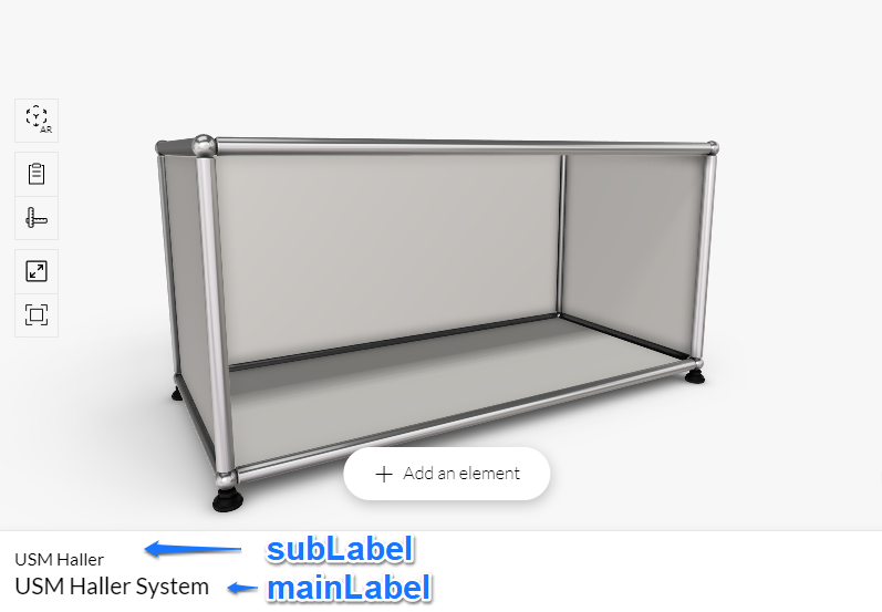
Currently the configurator shows the main label and the sub label:

Content of those labels follows this pseudo-code:
const label = rootComponentLabel || rapiItemLabel || catalogName || '';
const catalogLabel = (label === catalogName) ? null : catalogName;
const subLabel = (price) ? label : catalogLabel;
const mainLabel = price ? price : label;
Where:
rootComponentLabelis the constant database label of the component (component.label script is not used here)rapiItemLabelif configurator is loaded by itemId, catalogue label of the itemcatalogNameis the constant database label of the cataloguepriceis shown if pricing is used
To change labels in Rubens Admin, you can also upload the CSV with translations, see Adding translations (opens new window).
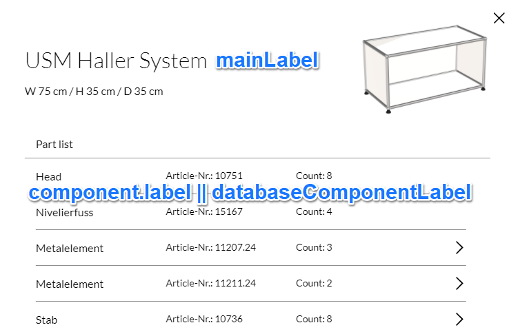
Part list entries show the label from component.label script or the component label in the database:

Note: component.labels (notice the difference with the previous - plural vs singular) object is legacy and is not used in current version of the Roomle Rubens Configurator.
# Aggregating part list entries using count
Part list entries aggregate together as count, if componentId, articleNr and parameters visible in part list match. Count is count of all same components, each adding 1 by default or subComponent.numberInPartList value.
Important: If labels are different, the part list entries will still aggregate and one of the different labels is shown. This is because two products with same parameters and SKU should not be called differently. You can solve this by adding a parameter that is different.
This is a cause of following error, where the part list says there are two left (links) elements, but actually should show one left and one right instead.

# Part List Grouping
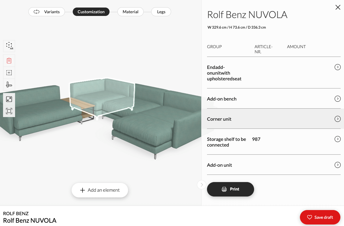
The configurator has a feature to put components in the part list into groups. The configurator must be run with the groupPartList key set to true (e.g.: https://www.roomle.com/t/cp/?groupPartList=true, see groupPartList (opens new window)). The component that defines the group header is the so called main component.
By default, main component is every component on top of the subComponent hierarchy (= standalone selectable configurable part). Therefore you will, by default, get as many groups as the number of docked components in the hierarchy is.
You can override the definition of the main component by using subComponent.isMain: Script<boolean> key, replacing the upper-level component as the main component.
If you set a component on top of the subComponent hierarchy as non-main (isMain is set to false), its parent component will be the group parent of that component. This is especially useful if you have for example sofa elements docked next to each other and you can dock a pillow to each of the elements. By setting the pillow child component as non-main, you can group the pillows under the sofa elements they are docked to.
The main component does not have to have numberInPartList bigger than zero to appear as the group header. If numberInPartList is zero, it will still appear in the part list as the group parent.
If you have two main components, both will appear as their own top-level group in the part list.
All non-main components appear only once in the parlist.
An example of the result can be seen in the JAB's Cube Lounge sofa system (opens new window). This sofa consists of elementary parts, like the platforms, seats, backrests etc., that the clients can assemble together in any way they desire. It is therefore useful to aggregate the parts in the part list together. If you open the part list, you can see only the three main components that are next to each other, and eventually unfold them to see what they consist of.
Hierarchical subComponent structure of this sofa system elements:
cubelounge_master (provides docking, does not enter part list)
    * cubelounge_inline
        * cubelounge_inline (backreference, "isMain": "true")
        * cubelounge_backrest
        * cubelounge_widearmrest
        * cubelounge_table
        * cubelounge_woodtable
        * cubelounge_seatcushion
        * cubelounge_platform
        * cubelounge_backcushion
        * cubelounge_headrest
        * cubelounge_armrestcushion
    * cubelounge_longchair
        * cubelounge_longchair (backreference, "isMain": "true")
        * cubelounge_backrest
        ...
    ...
{
    "internalId": "BACKREF",
    "componentId": "jab:cubelounge_inline",
    "isMain": "true",
    "numberInPartList": "1"
}
# Part List Highlighting
When you hover (on desktop) or click (on mobile) on an an entry in the part list, it gets highlighted in the scene. As you already know, the part list entries are components or subComponents. Going up through the subCompnent tree, the root component of the hierarchy is highlighted. Every docked component, which subComponent hierarchy contains the part list entry, gets highlighted.
If one part list entry comes into the part list from more docked component, every of those components are then highlighted. Consider using the part list grouping feature described above.

